RUBY: An All-in-One Educational Ecosystem
Project Introduction
- About Project: The RUBY platform is a next-generation all-in-one educational hub that seamlessly combines the functionality of a Learning Management System (LMS), video conferencing, project management, and a community social network.
- Client: RUBY Educational Technologies
- Goal: To create a unified, intuitive platform that eliminates the need for multiple disparate tools in educational settings, thereby simplifying workflows for students, educators, and administrators and improving overall engagement and collaboration.
- Audience: The platform is designed for a diverse user base, including high school students, college students, university professors, and educational administrators.
- My Role: Product Manager / UX Design Lead. My responsibilities included overseeing user research, synthesizing data into user personas and journey maps, defining the information architecture, facilitating the creation of wireframes and high-fidelity mockups, and building interactive prototypes for usability testing.
- Tools Used: Figma for design and prototyping, Visily and Uiazard for sketching, wireframing, collaborative brainstorming and journey mapping, Slack for grouping together ideation, and Google Analytics and Hotjar for post-launch performance monitoring.
- Collab’d With: CEO, Product Manager, Engineering Lead, and Marketing Manager.
- Industry: Educational Technology (EdTech)
- Discovery and Research
RUBY is an ambitious platform designed to be the single hub for students, educators, and administrators. Our initial research phase was dedicated to understanding the complex needs of this diverse user base and the existing landscape of educational technology. We aimed to answer a fundamental question: How can we create a unified platform that simplifies the educational experience without overwhelming our users?
Defining the Problem
We conducted a series of stakeholder interviews with school administrators, university deans, IBM engineers, Marketing professionals, students, and tech coordinators. These conversations highlighted a common pain point: platform fragmentation.1 They reported that students and teachers were juggling an average of four to five different applications—one for video conferencing (e.g., Zoom or Teams), one for the LMS (e.g., Canvas, Blackboard, Brightspace), one for project management (e.g., Trello), and another for community engagement (e.g., a school portal or social media group). This created a fragmented user experience, led to inefficient workflows, and complicated IT support.
Our problem statement was defined as: Create a unified educational platform that combines core LMS, communication, and collaboration features into a single, intuitive hub to eliminate platform fragmentation, reduce administrative overhead, and improve student and educator engagement.
User Research
To validate our assumptions, we conducted user research with 25 participants, including high school students, college students, high school teachers, and university professors. We used a mix of methods:
- User Interviews: We asked open-ended questions about their daily workflows, the tools they use, and their biggest frustrations. A recurring theme was the friction of switching between apps and the difficulty of keeping track of assignments, deadlines, and communications scattered across different platforms.2
- Surveys: We sent out surveys to a wider audience of 50 students and educators to gather quantitative data on their technology usage and preferences. The results confirmed that a significant majority (85%) felt their workflow would be simplified by an all-in-one solution.
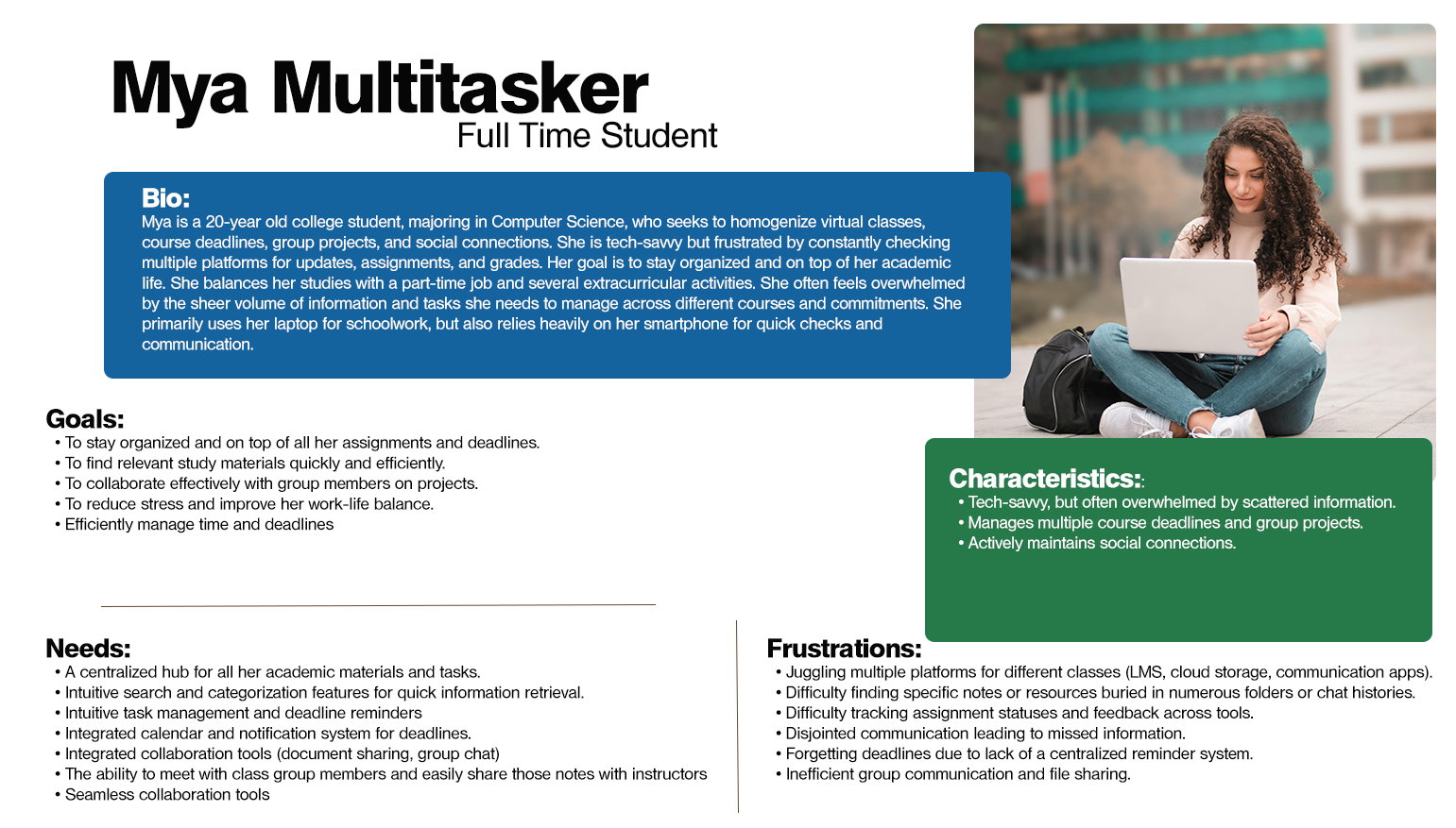
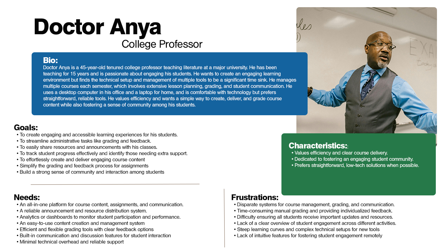
- User Personas: We synthesized our findings into two primary user personas that guided our design decisions:
We analyzed direct and indirect competitors to identify strengths and weaknesses.
- LMS Platforms (e.g., Canvas, Blackboard): These platforms are strong in core learning features like grading and content delivery but often lack robust communication and collaboration tools. They are generally not built for real-time interaction.
- Communication Platforms (e.g., Microsoft Teams, Zoom): These excel at real-time communication and video conferencing but are weak in structured learning features like gradebooks and assignment management.
- Project Management Tools (e.g., Trello, Asana): These are excellent for collaboration and task management but exist outside the academic workflow, requiring manual integration.
The analysis revealed a clear gap in the market for a platform that seamlessly integrated all three functions, which became our core value proposition.
- Analysis and Ideation
In this phase, we translated our research insights into actionable design strategies.4 Our goal was to create a cohesive and intuitive user experience that made it feel like a single product, not a collection of disconnected features.
Synthesizing Research
We mapped out the user journey for both students and educators, highlighting the pain points identified in our research. For instance, a student’s journey for a group project would involve:
- Receiving the assignment in the LMS.
- Creating a group chat on a separate messaging app.
- Setting up a Kanban board on a project management tool.
- Conducting a video call on a conferencing platform.
- Submitting the final assignment back in the LMS.
This fragmented journey solidified our design goal: consolidate these steps into a single, continuous flow within Ruby.
Information Architecture (IA)
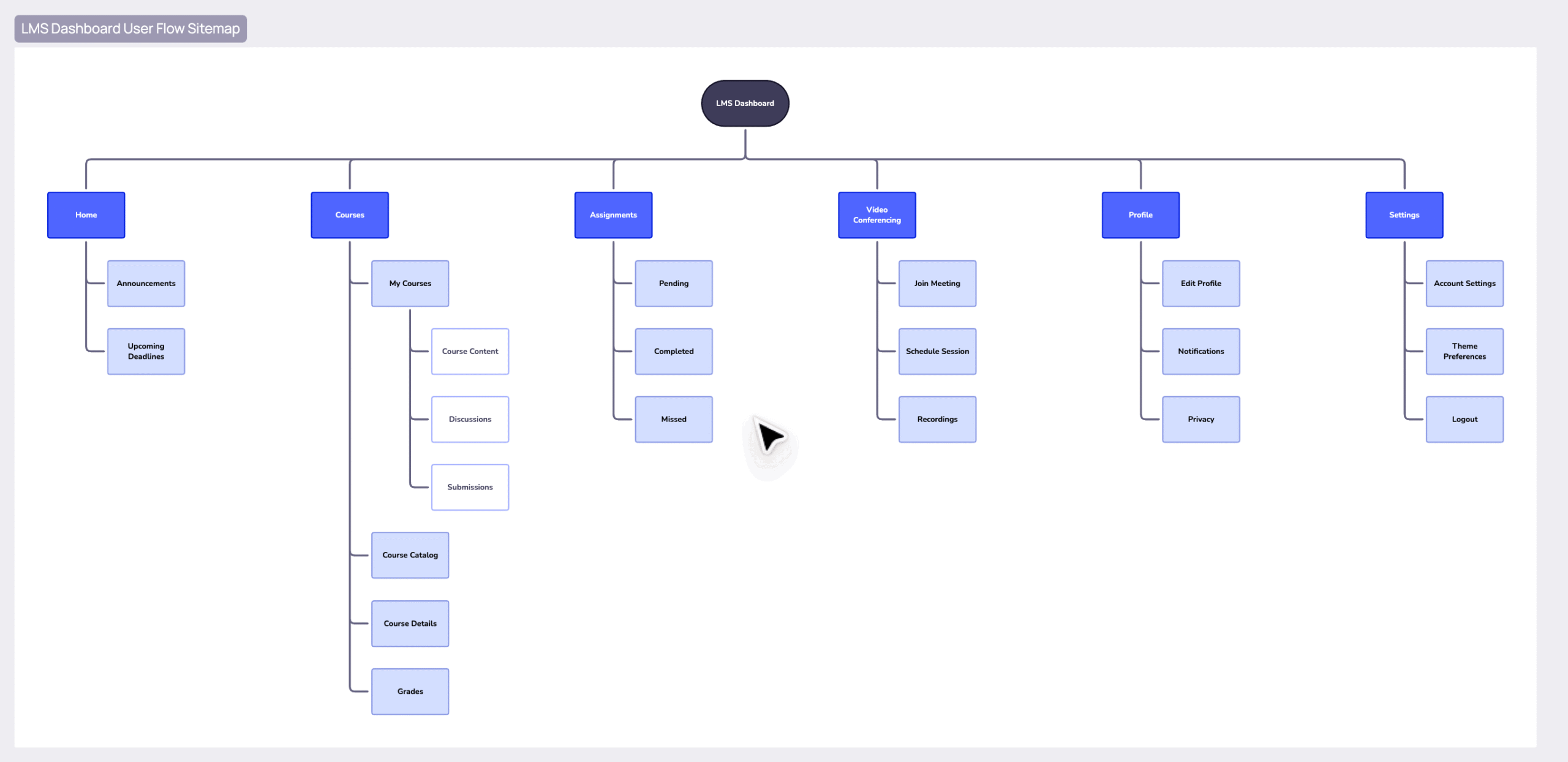
Our IA was designed around user workflows, not just a list of features. We created a sitemap and user flows that organized the platform into four main sections:
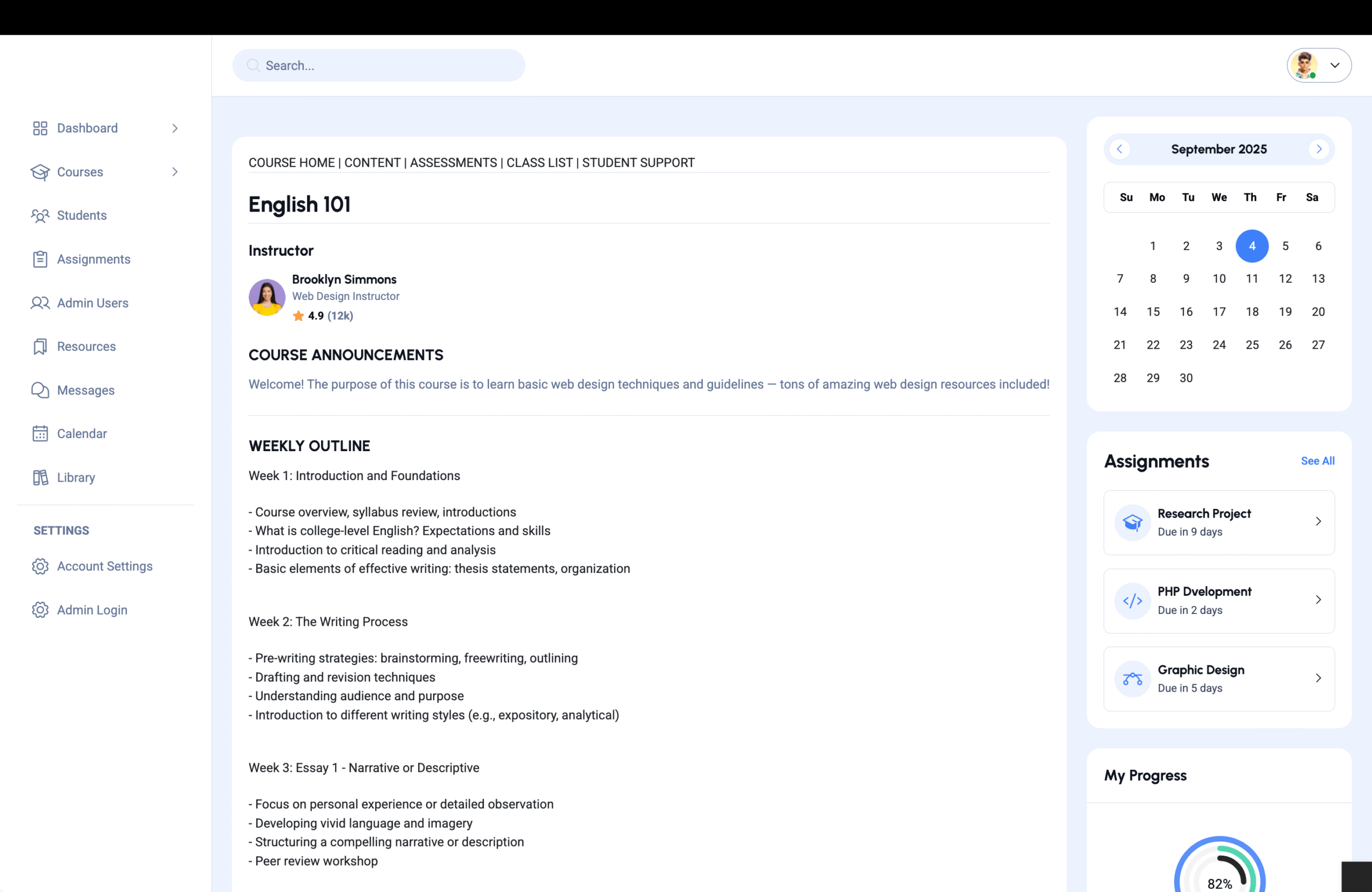
- Home: A personalized news feed with updates from courses, groups, and the wider community. This acts as the user’s dashboard.
- Courses: The core LMS section, where users can access all their classes, course content, gradebooks, assignments, and quizzes.
- Community: The social hub, with forums, group discussions, and user profiles. This fosters a sense of campus life beyond the classroom.
- Projects: The collaboration center, with dedicated Kanban boards and milestone trackers for team-based work.
This structure allows users to easily navigate to the part of the platform they need for a specific task without getting lost. For example, a project Kanban board is linked directly to the course it belongs to, maintaining context.
- Design and Prototyping
With the core structure in place, we began designing the visual and interactive components of the platform.
Wireframing
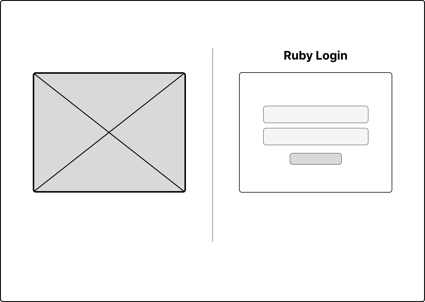
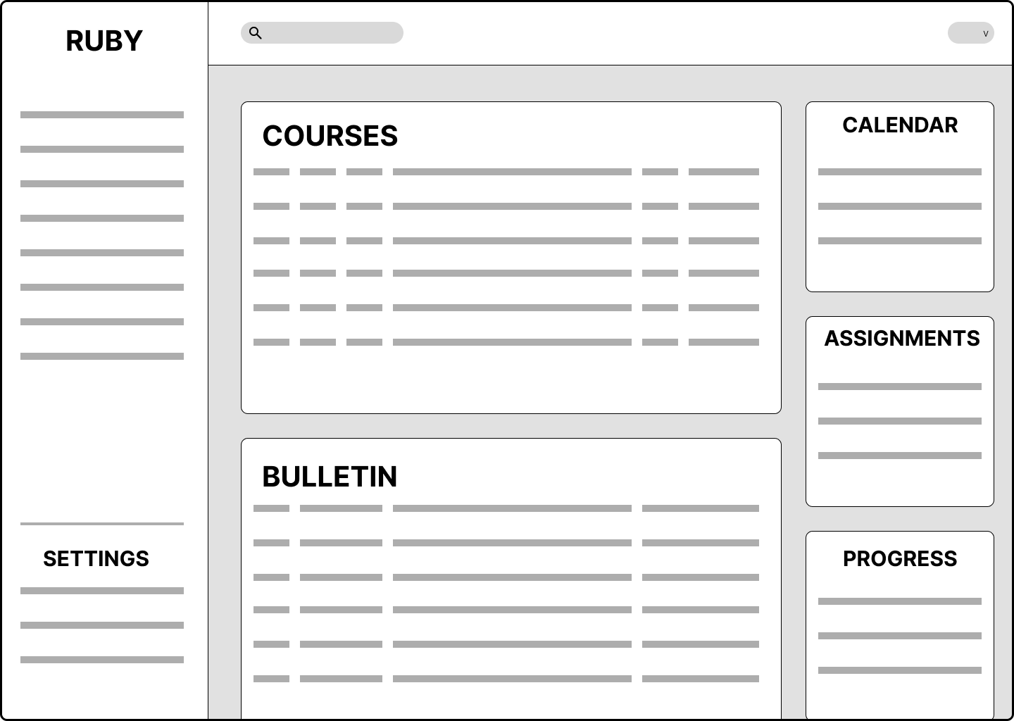
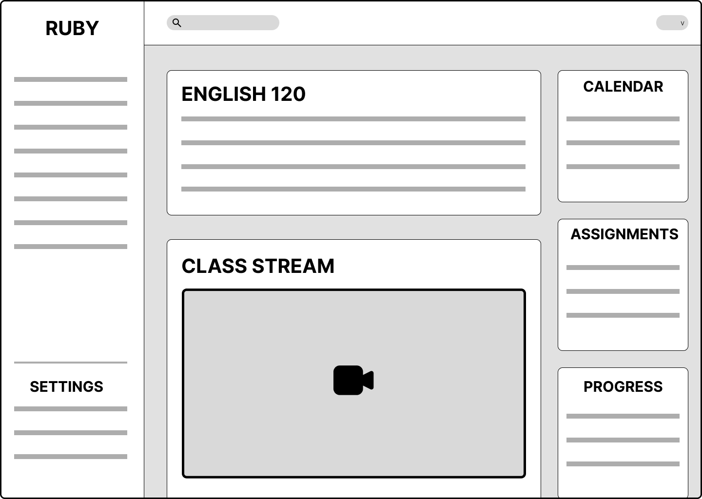
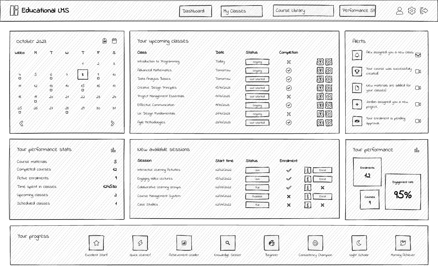
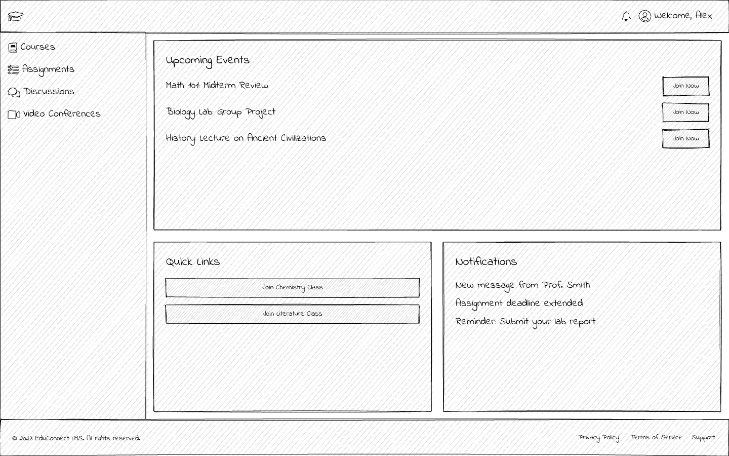
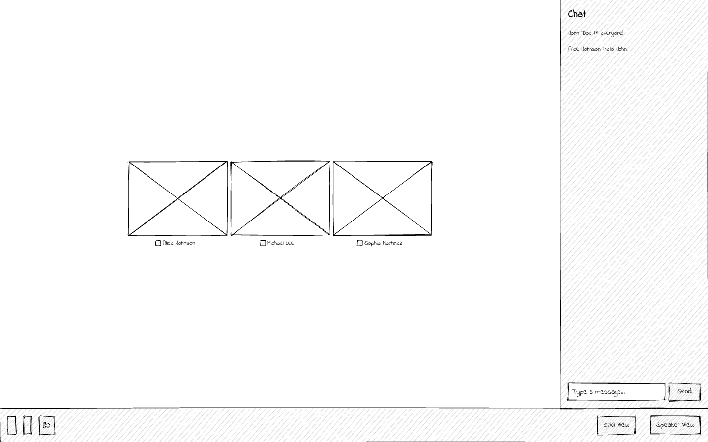
We started with low-fidelity wireframes of key screens, focusing on layout and functionality. This phase allowed us to quickly test and refine the placement of elements like the main navigation, course cards, and the assignment submission flow. The wireframes were intentionally minimal to focus on the content and structure rather than visual aesthetics.
UI / Visual Design
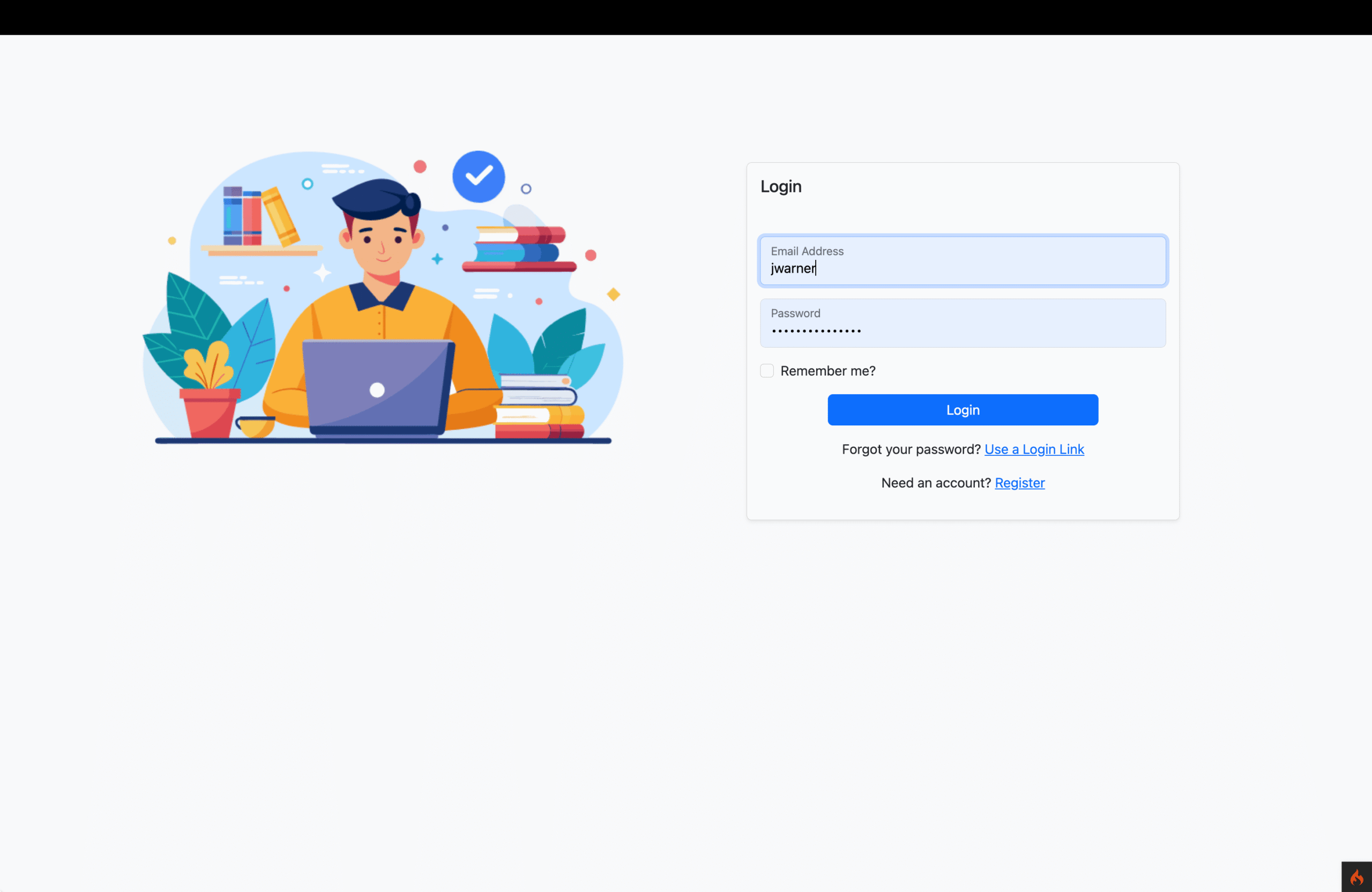
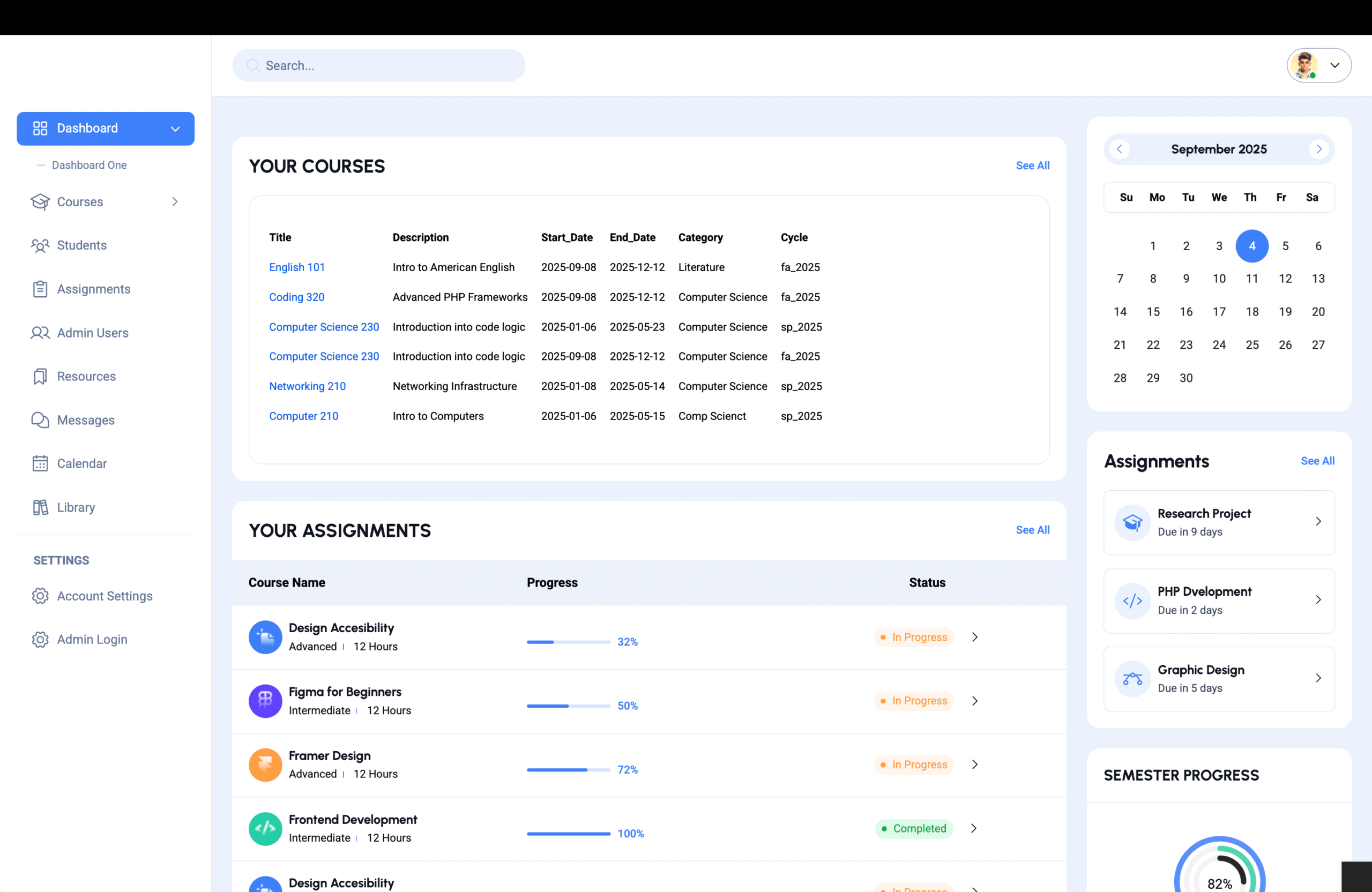
Our visual design aimed for a clean, modern, and friendly aesthetic.5 We used a calming and professional color palette (e.g., shades of deep ruby red and slate gray) with a high-contrast design to ensure accessibility. We chose a simple, sans-serif font for readability and used clear iconography to represent different features like the gradebook, forums, and video calls. The goal was to create an interface that felt professional and trustworthy while also being inviting for students.
Prototyping
We created a high-fidelity prototype using Figma, simulating the entire user journey. This prototype allowed us to test key workflows, such as:
- An educator creating a new assignment and a student submitting it.
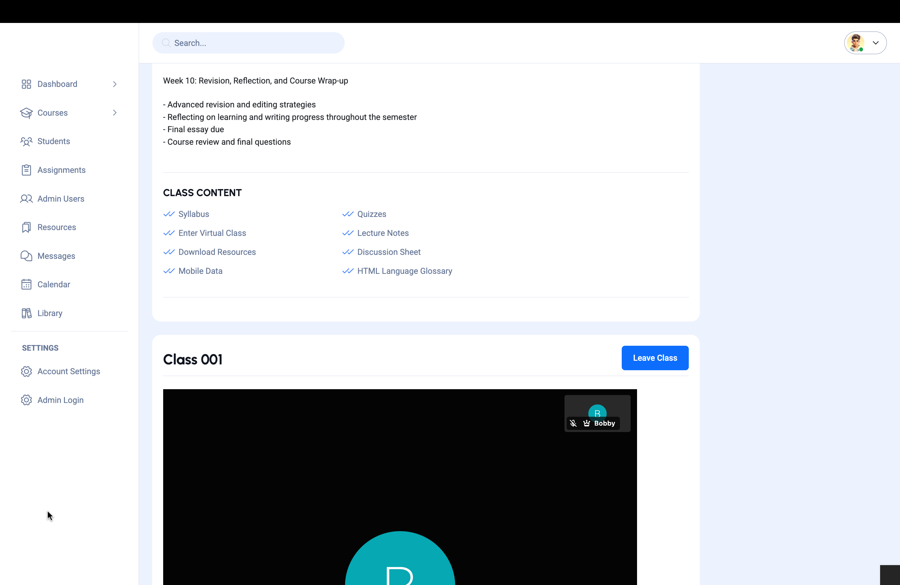
- A student joining a virtual class with breakout rooms.
- A group of students creating a project Kanban board.
This interactive prototype was a critical tool for our usability testing, allowing users to experience the platform’s flow before any code was written.

- Testing and Iteration
This phase was crucial for validating our design decisions and ensuring the product truly met user needs.
Usability Testing
We conducted a series of remote usability tests with a new group of 15 users. We gave them specific tasks to complete using our high-fidelity prototype, such as “Find your upcoming assignments for your History 101 class,” and “Create a project Kanban board for your group.”
Key findings included:
- Users loved the unified dashboard but were initially confused about where to find some features. We iterated on the main navigation to make the “Courses” and “Community” tabs more prominent.
- The assignment submission process was clunky. We simplified the upload flow and added a clear confirmation message to give students peace of mind that their work was successfully submitted.
- The project management tools were not as intuitive for first-time users. We added a brief onboarding tour and simplified the UI to make it more accessible.
Iteration
Based on this feedback, we made several rounds of refinements to the prototype. The iterative process was invaluable, ensuring that the final design was not just visually appealing but also highly functional and user-friendly.
- Development and Launch
With the final designs approved, our engineering team began the development phase.
Development
The front-end team used modern frameworks to build a responsive and fast interface that mirrored our high-fidelity designs. The back-end team focused on building a robust, scalable architecture to handle a high volume of users and data, integrating the LMS, communication, and project management functionalities.
Quality Assurance (QA)
The QA team conducted rigorous testing, including functional testing to ensure all features worked as designed, and performance testing to ensure the platform could handle peak usage times (e.g., during final exams).
Launch
We decided on a phased launch, starting with a limited beta release to one high school and one university. This allowed us to monitor performance in a real-world environment and gather initial feedback from a controlled user group. The beta launch also helped us fine-tune our support and onboarding processes.
- Post-Launch Evaluation and Maintenance
The work on Ruby continues well after the initial launch.
Performance Monitoring
We use tools like Google Analytics and Hotjar to monitor user behavior. We track key metrics like:
- Active Users: To measure engagement across different user segments (students vs. educators).
- Feature Adoption: To see which tools (e.g., Kanban boards, quizzes, forums) are being used most frequently.
- User Flows: To identify any drop-off points or areas of friction that we missed in our initial testing.
User Feedback and Support
We have established multiple channels for user feedback, including an in-app feedback form, a dedicated support team, and an active online community forum. This continuous stream of feedback is essential for our ongoing maintenance and future feature development. We regularly address bug reports and user requests, using this information to plan future product updates. The Ruby platform is a living ecosystem that will evolve with the needs of the educational community it serves.
